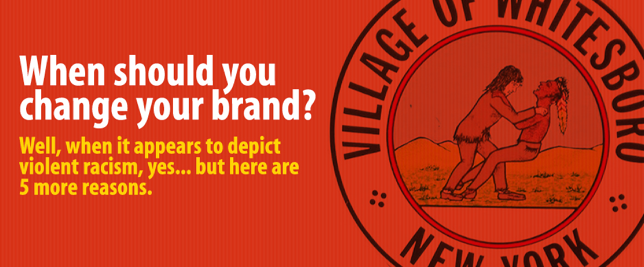
The village of Whitesboro is deciding that question tonight, and their story has gotten national attention. Our corporate office is located in Clinton, NY, not far from Whitesboro, and several of our staff are alumni of Whitesboro high school, so Whitesboro, we speak to you with true affection as your leaders take up the issue of your controversial seal/logo, shown here in the New York Post, here on Mashable, here in the Huffington Post…and the list goes on…
At first glance, most would agree the image on the logo appears to be a white man strangling a native American. Apparently this is not the case; we’re told it represents a friendly wrestling match. Whitesboro is also named for its founder, Hugh White, and not because its residents are primarily Caucasian. Both of these facts have been used to defend the seal, but let’s take a step back and see if it passes the test for any good logo, the most visible representation of any brand.
1. It should represent the best ideals of your organization, instantly.
No explanation of your logo should be necessary. If you actually have to explain to people that this isn’t a white man strangling a native, you’re way behind in conveying your best ideals.
2. It should be timely and current.
Let’s face it, times change. People change. The world changes. It’s time to leave the past to historians.
3. It should be simple.
Too much detail muddies your image. Hands on shoulders or neck? Wrestling or killing? This is not a simple, clear impression.
4. It should be memorable.
OK, we’ll concede: it’s memorable! But you want it to be memorable in a good way, leaving people with a positive impression. If so many people take offense, does it really matter what you meant it to say?
5. It should speak to your future.
An effective logo can make a stylistic nod to your past, but it must convey where you are going, a positive message for your future. What do you think: does this image say something positive about your future?
By almost every measure, your seal doesn’t represent the best of its people. And if we’re honest here, it never passed the test of a good logo when it was first created!
Like the confederate flag, it may have ties to the area’s history, and even have a positive association for some people. But it’s not about what you want it to say; it’s about what people think it says.
So as you vote tonight on whether to change the seal, while this is certainly democracy at work, are you only prolonging the obvious? What do you think, Whitesboro? Isn’t it obvious?
(Hear what his dog has to say about him)